Overview
This project demonstrates how to design a complete Business Intelligence workflow from synthetic data generation to visualization and forecasting.
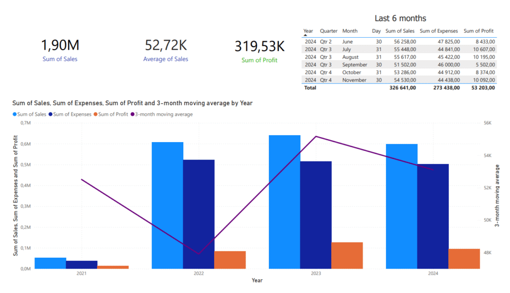
I built a small web app that generates realistic sales datasets for Power BI practice and then used it to create an interactive dashboard highlighting sales trends, expenses, profits, and a 3-month moving average forecast.
Process
- Data generation:
Used my custom React + Vite app hosted on Vercel to produce synthetic monthly sales and expense data with controlled growth and random variation. - Data visualization:
Imported the dataset into Power BI and created a dashboard combining bar charts, KPIs, and a 3-month moving average line to reveal underlying sales trends. - Forecasting logic:
The “Sales Forecast” line applies a DAX formula calculating a rolling 3-month average of total sales — a simple way to visualize short-term momentum and identify trends. - Tools & stack:
- App: React + TypeScript + Tailwind (deployed on Vercel)
- Visualization: Power BI Desktop
- Data scripting: Python (optional dataset generator)
Key Learnings
- Understanding of time-series modeling in BI context.
- Building reusable BI practice data tools.
- Applying DAX functions like
DATESINPERIOD()andAVERAGEX()to smooth real-world metrics. - Designing clear and actionable dashboards combining raw and trend-based data.
See it live
Outcome

